• Skip to main content
  • Skip to footer

KKom, Inc.

Serving Milwaukee's Web Marketing, Design, SEO, Social Media, Direct Mail and Color Printing needs for over 22 years

  • Marketing
    • Milwaukee Marketing Services
    • Promotional Marketing
    • Brand Marketing
    • B2B Marketing
    • Integrated Marketing
  • Creative
    • Creative Services
    • Graphic Design
    • Video Production
    • Animation
    • Drone Photography
    • Recording Studio
  • Web
    • Website Design
    • Internet Marketing
      • Web Strategy
    • Search Engine Optimization (SEO)
      • Top Reasons to use SEO
      • Content Development
    • Pay Per Click (PPC)
    • Social Media Marketing
    • Website Maintenance
  • Print
    • Printing Services
    • Digital Printing
    • Restaurant Menus
    • Brochures
  • Our Work
    • Photography
    • Video Production
    • Web Design
  • Blog
  • About
  • Contact
  • 262-250-2060

Menu Printing

Top 6 Restaurant Menu Design Mistakes

August 8, 2017 by K-Kom

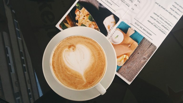
Your restaurant’s menu is as important as the merchandise display to any major retailer. You want to display everything you have to offer clearly, while highlighting the things you would like to sell more of.

A survey done by the Gallup reported that most customers will spend about 109 seconds reading a menu, so that’s the amount of time you have to get your message across and sell the things you most would like to sell.

Knowing this, the more you have in your menu (eg. multiple pages like Cheesecake Factory and TGI Friday’s) the longer it will take for someone to make a decision, and the longer it will take to turn over your tables, especially for first time customers.

Another study done found that many sales came from only 18-24 of their menu items, so by limiting the menu, table turnover time can be improved while decreasing inventory needs.

Common Menu Mistakes

  • Hard to read: this can be caused by small font size, font and background color, crowded pages, as well as restaurant lighting
  • Overemphasized prices: having prices listed in a column may cause customers to disregard items based simply on price
  • Monotonous design: using the same design on each item will not allow anything to stand out. Make sure to emphasize your best or favorite items, especially items you would like to sell more of. Photos, different fonts, colors, etc.
  • Not matching the restaurant: the menu should complement the atmosphere and type of restaurant you are – formal vs casual.
  • Too big: size matters when compared to the table and place settings. Don’t create awkwardness with an oversized menu and small crowded tables with wine glasses.
  • Not using valuable space: don’t forget the front and back covers. Put information about your business including the name, address, even the history if you have a good story and extra space!

If you would rather not leave this very important part of your restaurant business to chance, contact K-Kom and one of our designers will be happy to discuss your menu design needs!

We also offer print services to ensure your menu is exactly the way you want it.

Filed Under: Blog Tagged With: Menu Design, Menu Printing, Restaurant Menus, Restaurant supply

Best Printing Tips for Flyers, Menus, and Brochures

June 6, 2017 by K-Kom

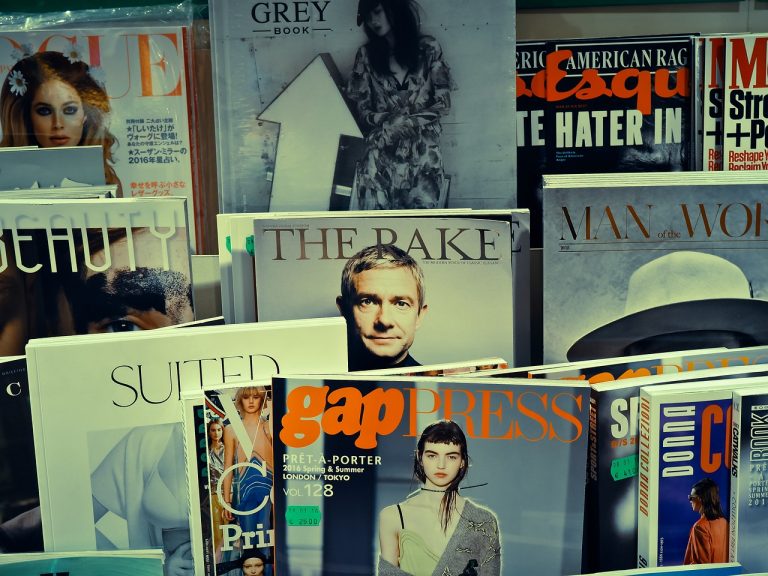
Everyone is rushing online to be heard, seen, bought! But there is definitely still something to be said about a nicely printed souvenir from a business or event. These types of things, as they become more and more rarely done, enhance your uniqueness factor tenfold.

So here are some tips when choosing your flyer, menu, or event’s printed materials from the print shop near you:

Content and Color

  • Don’t be afraid to let this thing stand out. You want to be remembered right? Convey your brand or event’s special qualities and sophistication.
  • Colors can be used to create a certain feeling or mood. Choose a combo that will appeal to the type of message you want to communicate. Here are 30 great example color schemes you can try out! (PDF).
  • Have a killer headline. The average attention span is supposedly shorter than a goldfish (ie. less than nine seconds), SO your headline or title has to be action-oriented, memorable, funny, in-the-moment, or at the very least relevant to your audience.
  • No long paragraphs. Speaking of short attention spans. Use bullet points, lots of pictures or graphics.
  • Stick to the point (and the BENEFITS). What is the primary goal of this printed thing? Don’t try to achieve lots of goals in one shot because that will be confusing and far less effective than you’d like.
  • No grammar mistakes please!

Paper Choice

Think of this in terms of: if you could take your biggest hero or favorite celebrity out for a night, would you take them to McDonald’s? Or would you impress them with the nicest things your town has to offer? Think of your customers this way. Without them, you’d be eating at McDonald’s (or working there). Therefore, treat them like the best in the world. Give them something that represents the reputation you want your business to have.

What kind of mood do you want to set?

  • Glossy finish will make your message pop with a little shine, and a little “look at me”. Very durable and good for two sided printing, but more easily gets stained. Where will you be putting these?
  • Matte finish is softer on the eye, deflecting glare and is more resistant to stains. Used by professionals and photographers, it gives a more relaxing feel. How do you want your audience to react?
  • Colored paper is a good option if you’re printing in black and white and still want that standout appeal for your message.
  • Premium paper is smooth and pure white, resistant to smudging, and is great for rich, clear photos and presentations.
  • Go for recycled paper if promoting any sort of environmental message!

Let’s print already!

  • Pick a paper size

    • Business Brochures: folded in thirds with the standard 8.5” x 11” is the most common and easiest.
    • Event Flyers: many people use the standard 8.5” x 11” but smaller down to 4.25” x 5.5” work as well.
    • Restaurant and Wedding Menus: these vary greatly depending on the amount of food or products you offer, your desired fonts, number of photos, etc. The average restaurant menu size according to Google is about 9” x 12” but you want to also take into consideration the size of your tables and place settings. Don’t create unintended awkwardness for your customers!
  • Paper weight:

    (and no I don’t mean that shiny rock you have on your desk at work).

    • 70 lb Text – 100 lb Text: used for brochures, flyers, or magazines
    • 67 lb Bristol: good for raffle tickets or postcard handouts
    • 65 lb Cover – 110 lb Index: used for menus and posters
    • More detail on paper stock.
  • Ink:

    • If you don’t mind spending a little more money, glossy ink will print photos very nicely.

Lastly don’t forget, the more you print the cheaper it will be per piece!

If you’d like help with your design phase, and/or are looking for digital printing services, K-Kom is here to cater to your needs!


“OK Google: printing services near me!”

Filed Under: Blog Tagged With: Brochures, Menu Design, Menu Printing, Printing Services, Restaurant Menus

Footer

  • Milwaukee Marketing Services
  • Promotional Marketing
  • Brand Marketing
  • B2B Marketing
  • Integrated Marketing
  • Responsive Website Design
  • Internet Marketing
  • Search Engine Optimization (SEO)
  • Pay-Per-Click (PPC) Strategy
  • Social Media Marketing
  • Website Maintenance
  • Creative Services
  • Graphic Design
  • Video Production
  • Facebook
  • Instagram
  • LinkedIn
  • YouTube
  • Animation
  • Digital Color Printing
  • Quality Printing Services
  • Color Brochure Printing
  • Blog
  • About Us
  • Contact Us

KKom Marketing Logo
262-250-2060

7434 N Lannon Rd
Lannon, WI 53046

© 2001–2022 KKom, Inc.
All rights reserved.